
SO, WHAT’S THE PROBLEM?

Financial literacy isn’t taught in Canadian schools
40%
of young Canadians report that money is a daily concern
55%
of young Canadians struggle with numeracy skills
65%
of young Canadians don’t feel confident about their finances
66%
of young Canadians live paycheque to paycheque
Let’s talk to the people!
What makes learning about finances so difficult?
I conducted 6 interviews and uncovered three major pain points for learners: embarrassment, decentralized information, and a lack of public resources.
-

Feelings of Embarrassment
People experience embarrassment and shame about their conceived level of financial literacy
-

Decentralized Information
Resources on Canadian financial literacy exist, but are decentralized, and take a lot of time to absorb
-

Lack of Public Resources
It is a systemic failure that financial education isn’t included in public curricula


UNDERSTANDING THE USER
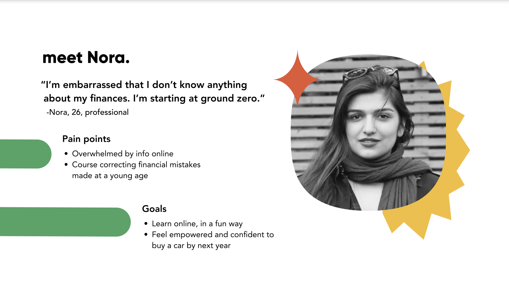
“As a learner, I want lessons to be all in one place, so that staying organized is effortless, and it’s clear what I should focus on.”
- Nora
Core Epic & Task Flow
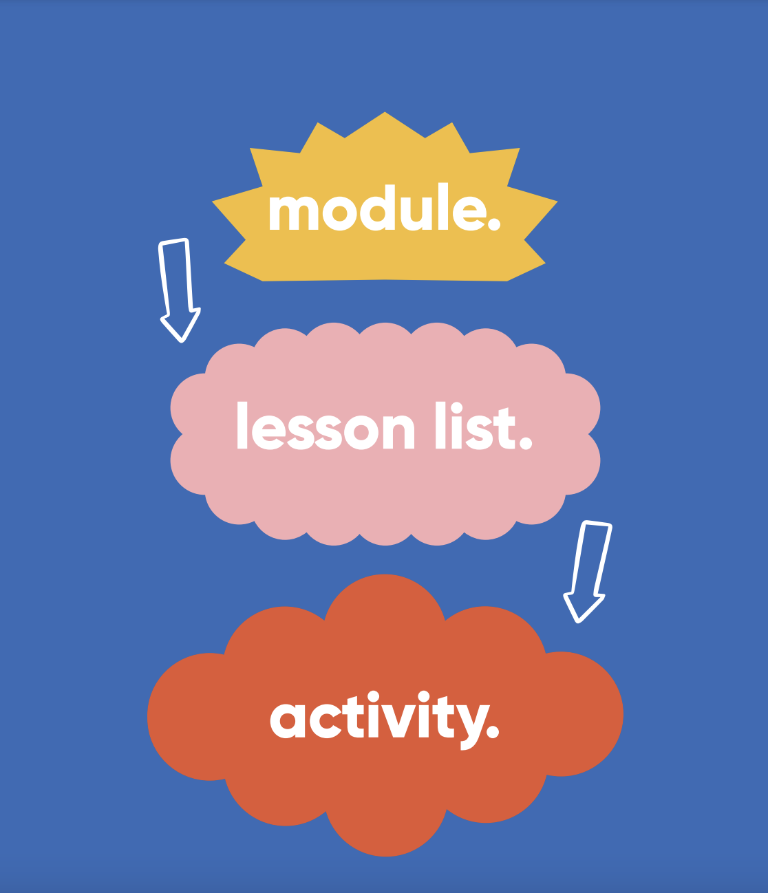
In exploring Nora’s current user journey, I realized that her biggest struggle is feeling overwhelmed trying to learn online. So, I focused on designing bite-sized lessons for Nora, so concepts are digestible.
Lessons need to be memorable, fun, and engaging. And Nora needs to be able to learn on the go. Imagining Nora using welling. from her phone on the train during her commute home, I decided to focus on the task of Nora finishing a lesson activity. Short! And! Sweet!

IDEATION & ITERATION
SKETCHING
WIRE FRAMING
User Testing
Based on two rounds of user testing, I made several improvements to my wireframes:
1. Listed of lessons on module summary page turned to cards for better legibility and clickability
2. Added progress bar or road map to the top of the Lesson List page
3. Included percentage or numerical value on progress bars on lesson activity pages
4. Added more spacing on lesson cards on lesson list page
5. Added header to lesson list page, and cards into units or sections
6. Changed active state to a colour instead of a filled icon

BRANDING

Visual Identity
It was very important to me for the visual identity of the project to feel really friendly, fun, and approachable, wanting the user to feel empowered, inspired, and supported in making big money moves. No big banking bullies here! Zero intimidation.
I’ve used minimalist design throughout, and kept things simple, and familiar for the user. I went with bold colours, and abstract geometric shapes to bring energy and playfulness to a topic that often feels rigid, stuffy, and serious.
BRAND GOALS

DESIGN SOLUTION
Why welling?
Through my interviews, I came to realize that so many young Canadians think about finances and financial literacy as being scarce. I wanted to communicate abundance. An overpouring of support. A bursting spring of confidence. A welling knowledge of finance!
Prototype
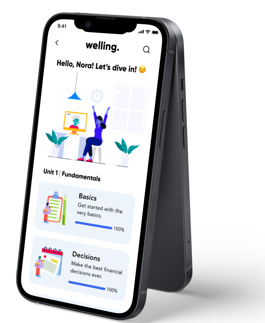
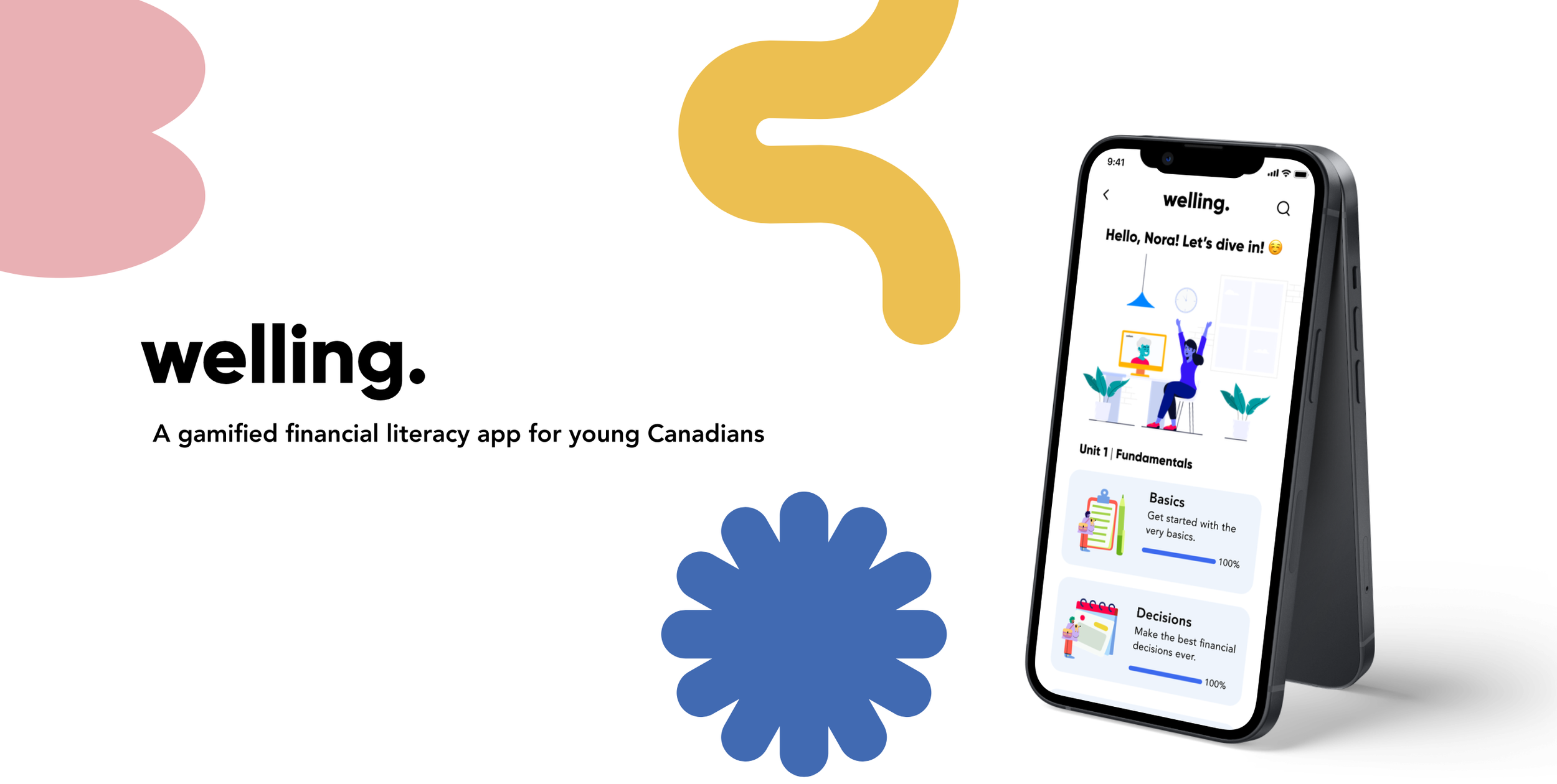
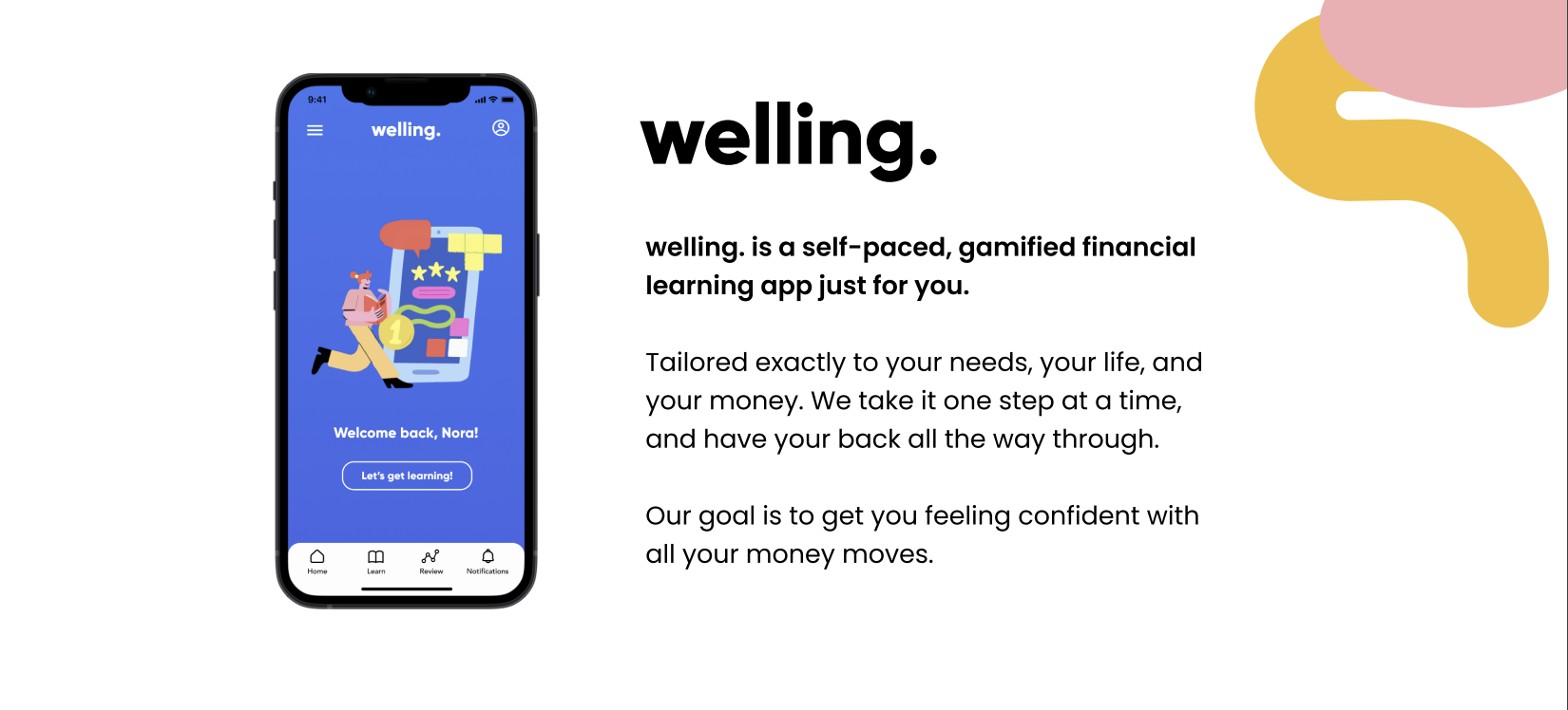
welling. is a centralized and cohesive educational resource of fundamental financial concepts. Made for young people in Canada to achieve increased financial literacy, and higher levels of self-efficacy in financial decision making.
The design emphasizes ease, using a minimalist approach to information architecture. The user can easily complete a lesson on Income Tax at their own pace, from their own place.

-

Marketing Website
I designed a marketing website for the welling. native mobile app, in the hopes that people like Nora can get started making their big money moves, and feeling good about their financial knowledge.
-

Mobile Website
Considering responsive design, I also crafted a marketing website for mobile. This way, should someone be on the go, they could easily come across welling. as a solution.
-

welling. for Desktop
As a learning app, I thought it was important to design welling. for desktop as well. For those ready to hunker down at home, the desktop version allows for some deeper learning.

IMPACT & FUTURE THINKING

Appendix
-
Build out curriculum and lesson activities with varying multimedia
Gain insight from more intersectional users, with more varying backgrounds
Continue secondary research to better inform UI design, integrate animation, and draw my own illustrations
Better consider accessibility throughout my design, and ensure all would benefit from its use
-
Thanks for your curiosity about my work!
To see an expanded version of my process and my UI Library please visit the following link: -
Should you have any questions about my process or project, please feel free to reach out to me at stpelka@gmail.com. I’m more than happy to get deep into the work with you.
Let’s work together!
Like what you see? I’d love to hear from you!
I’m currently looking to join a creative team.
stpelka@gmail.com
(519) 903-8555

